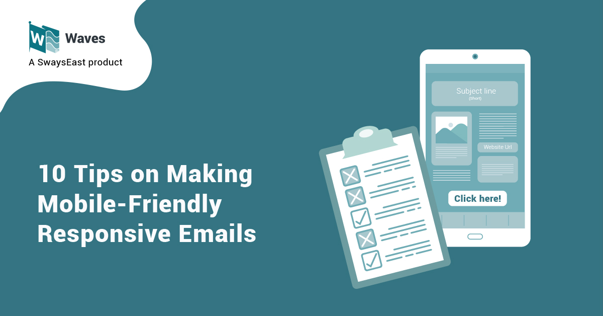
It’s official: Online users prefer checking their emails on their smartphone rather than on desktops, laptops, or other digital devices. At least four billion people use email around the world in 2021. Half of global web traffic in 2021 is attributed to mobile usage – around 54.4%, according to Statista. Global Stats revealed that 54.86% of over 347 billion emails sent and received per day by 2022 are accessed via mobile. Mobile application is what 61.9% of consumers use for checking their inbox while 89% of marketers use email as the primary channel for generating leads. No matter how you count what’s on different studies, mobile is big and getting bigger.
Unfortunately, mobile-friendly email adoption still lags among businesses and digital marketers. But there’s a big difference there. Having a ‘responsive” design doesn’t necessarily mean the email is optimized for mobile. Here are 10 tips on making mobile-friendly responsive emails.
1. Optimize for a 3-second read
Always remember that mobile readers spend three seconds or less with your emails. Of course, some readers will stay with your emails longer. Just make sure those first three seconds of assessment will encourage subscribers to linger and not to leave.
2. Keep subject lines short
Sender name is still more prominent in mobile devices – but the subject line is still crucial. You can get away with a longer subject line – if you’re smart about how you write the copy. But experts suggest 30 characters is best for mobile email subject lines which means you have to put the most important information first. This way, they’ll get the basics of your message. If readers decided to stay, then they’ll see more of it as they scroll down.
3. Use preheader text
Did you know that there’s more room allocated to preheader text than to subject lines when viewing emails from a mobile device? Consider starting with copy that is basically a sub-header or copy that’s a call to action. This will help you maximize this precious space on the “can’t read this email?” link.
4. Keep your email on-brand
This helps to match your email templates with your visual identity – a powerful way for readers to build a stronger relationship with your brand. Use interesting, complementary colors while sticking to just two font style (one for headlines and another for body text) that will help make your copy look aesthetically pleasing and recognizable.
5. Think horizontal and vertical
Emails should look good in both portrait and landscape view. Mobile devices require single-column layouts that are no wider than 600 to 640 pixels work best on mobile devices. Position all important design elements in the upper portion of the email if possible.
6. Make the type size readable
Follow Apple’s lead – use 22-point type for headlines and at least 16-point type for body copy. Larger type shortens line length and ensures that your copy gets read.
7. Keep images small
Large images are the #1 inhibitor of fast load times. Resist the urge and keep your files below 5-6kb per image – less than 2kb if more than 20 images. Choose the highest quality photo and format so they won’t appear pixelated. These crisp images should also be accessible to visually impaired individuals (think alt text and color contrast).
8. Make your CTAs and social media icons clickable
This is a must; otherwise, you will defeat the purpose of sending emails to busy subscribers and the potential to convert them to paying customers. The minimum recommended “clickable” size for calls-to-action is 44 x 44 pixels with 10 pixels of space around them. As for social media icons, let them take up a whole width of the email.
9. Pay attention to hyperlinks
By placing links within your email copy, this will boost the chance that your readers will click it and be taken to your site or your independent landing page. If you use regular text messages instead, you can add the URL as text.
10. Craft compelling copy
Writing copies for emails might feel like an overwhelming task most of the time. You put hours of effort into writing the perfect email subject line, preview text, and body only to have your open and click-through rates fall flat. Avoid industry jargon but keep it short, clear, and straightforward. Nail your subject line and keep your content relevant for your target audience.
How can SwaysEast help?
Email templates using Waves platform are optimized for increasing engagement and email deliverability while decreasing the likelihood of ending up in the spam folder. This includes best practices on reaching the right recipients, understanding user behavior, and crafting content that readers would want to read. Get started with Waves for FREE!

